SVGs can unlock a new level of customization within Power BI, allowing us to craft designs beyond native visuals that can be tailored to our project needs. They can be the perfect addition to instantly provide that extra insight required to communicate our data story. This tutorial will explain the first steps of working with SVG measures and walk through the creation of a basic RAG indicator icon.
Sourcing and Preparing the SVG
The first step of creating an SVG measure is deciding the base shape for the visual. For the RAG indicator this is a circle.
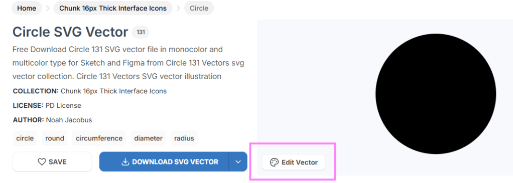
Sourcing: svgrepo.com
- Navitage to svgrepo.com and search for circles
- Click on ‘edit vector’:
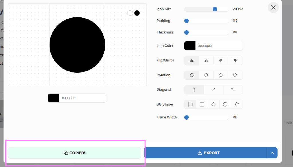
- Copy the SVG text
Preparing: Format & Data Categorisation
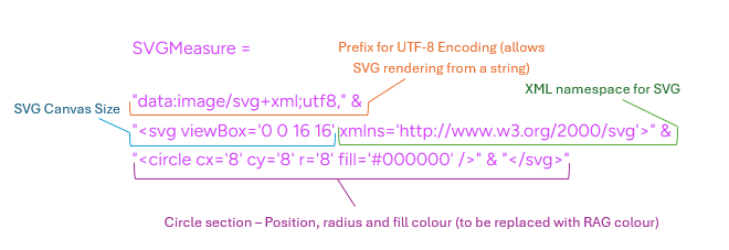
To render in Power BI, the format needs to be amended to replace double quotes (“) with single quotes (‘) and to include prefix: data:image/svg+xml;utf8,. You can use AI, just remind it to include the UTF-8 prefix.
Raw copied SVG:
<svg viewBox="0 0 16 16" fill="none" xmlns="http://www.w3.org/2000/svg"><g id="SVGRepo_bgCarrier" stroke-width="0"></g><g id="SVGRepo_tracerCarrier" stroke-linecap="round" stroke-linejoin="round"></g><g id="SVGRepo_iconCarrier"> <circle cx="8" cy="8" r="8" fill="#000000"></circle> </g></svg>
Encoded by AI for Power BI rendering:
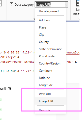
Add the measure to your Power BI report and set the image category to ‘Image URL’:
This will now render as a plain circle when added to a visual that supports SVGs (table, matrix, card visual).
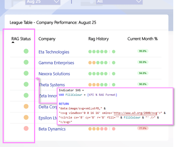
Applying Dynamic RAG Fill Colour
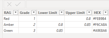
To dynamically apply a fill color based on the status of the measure you are visualising, you will either need to reference another RAG measure or build the logic within the SVG measure. For this measure, I have a RAG limits table that allows me to pass in a KPI % and assign a HEX code:
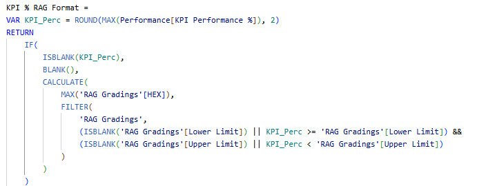
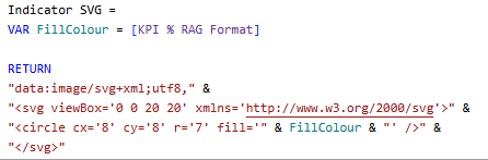
The ‘KPI % RAG Format’ measure will return a hex code for each KPI % value to be visualised, which can then be passed into the fill section of the SVG measure:
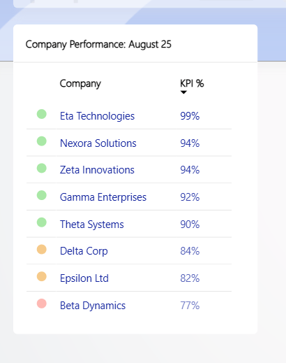
The Final Product
After some tweaks to the circle radius, SVG canvas size, or the ‘Image size’ section in Power BI to fit the text size of the visual in use, the icon will render as below 🔴 🟠 🟢!
Thanks for reading! If you found this helpful, subscribe for more content!

Leave a comment